AND’s website refresh:
Bespoke illustrations / icons - 2023
AND Digital
After expanding their service offerings, tech company AND Digital needed a refreshed website, showcasing not only an upgraded structure, but also an overall modernised look.
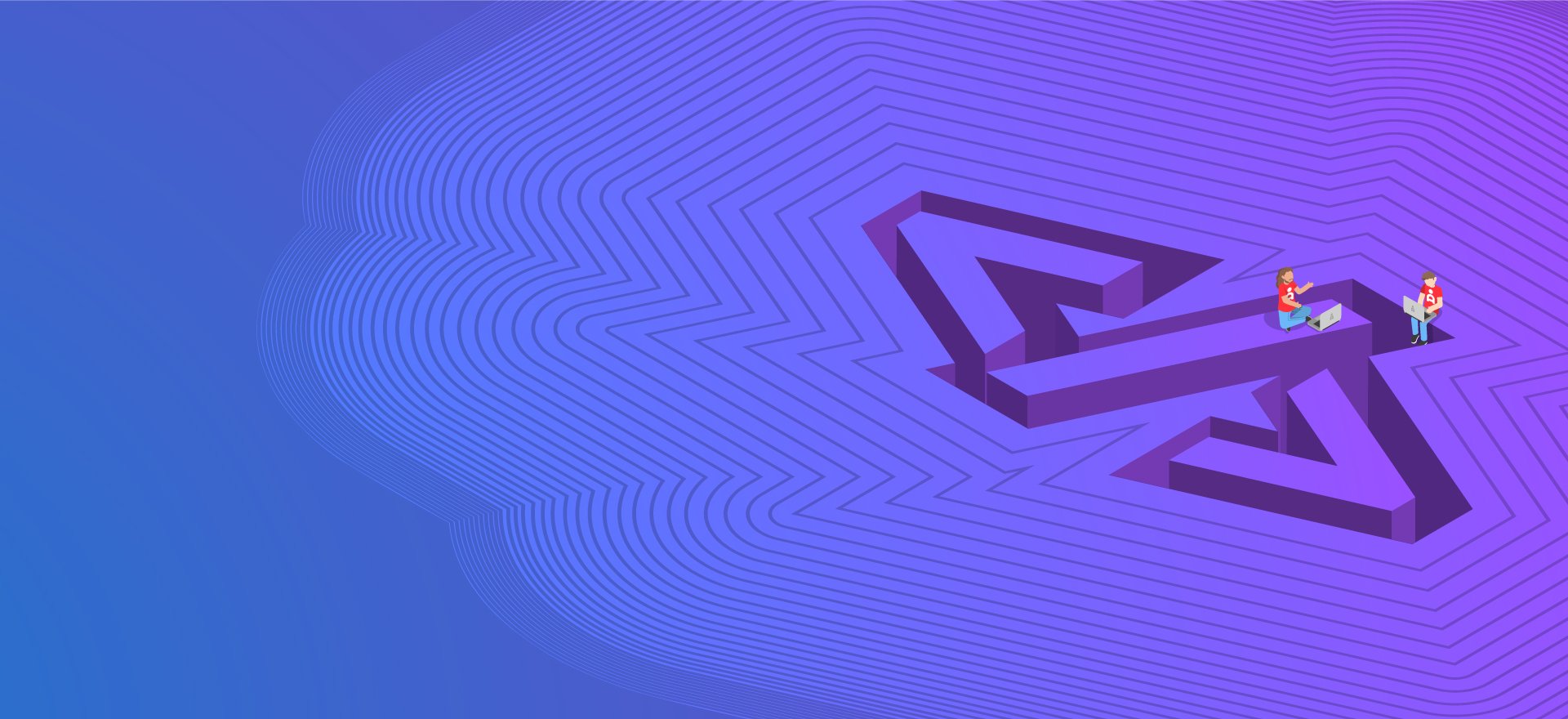
I was tasked with developing a visual language for their 10 new capabilities pages, clearly representing each respective topic ( Data, Software Engineering, Cloud, AI…) to be displayed both in the format of striking hero images and complementary, smaller, featured images.
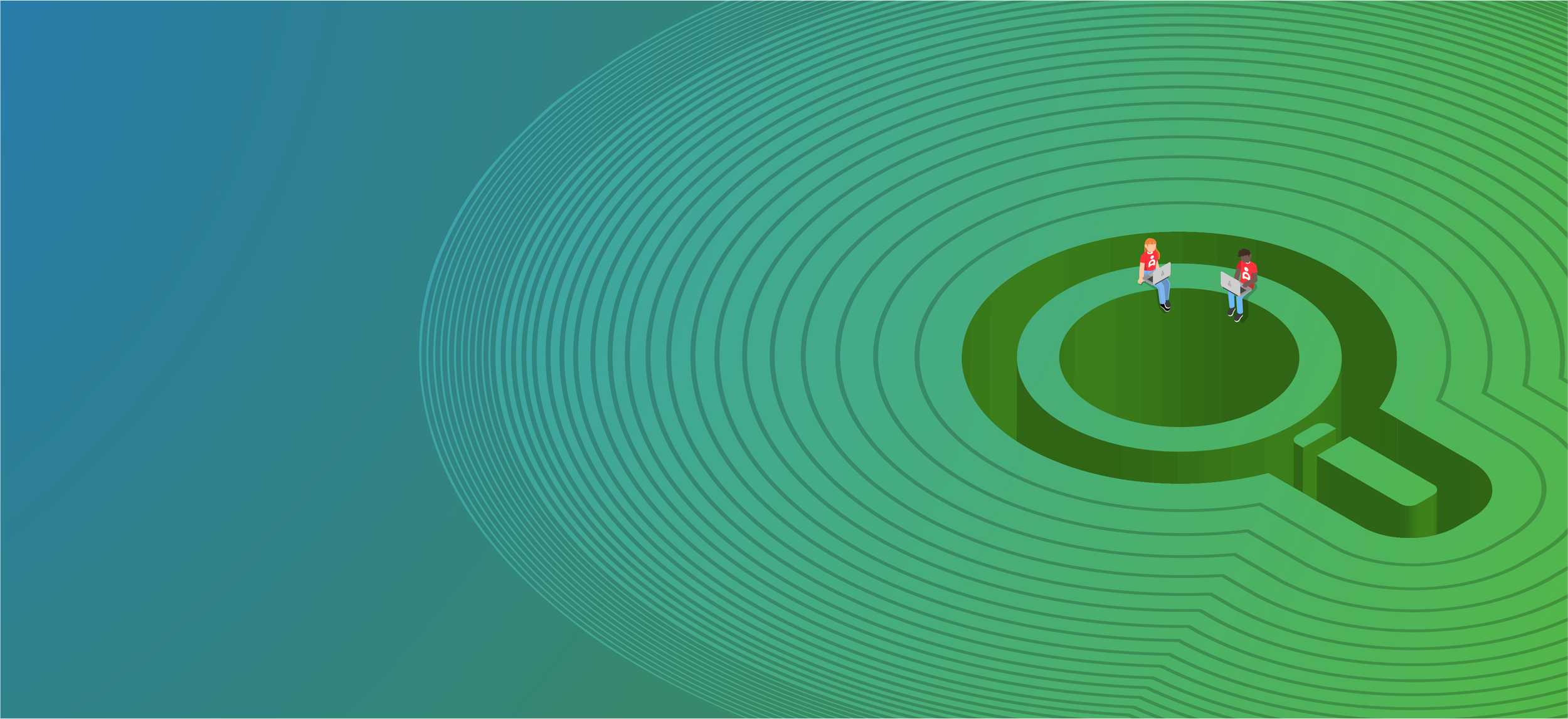
As the project evolved, I also produced bespoke artworks for key sections of the website, including landing pages for the About, Search, and People pages, aligning all visuals with the updated brand identity.

Challenges:
The website refresh aimed not only to enhance the design but also to improve its structure. In the early stages, I collaborated with the developers to understand the new modules and assess any limitations that could impact design decisions.
Creating the visual language for these new pages presented a unique challenge. Many key themes, like Cloud, Data, and AI, are abstract and difficult to represent visually. Additionally, the bold color palette of AND Digital posed the challenge of maintaining a sophisticated aesthetic while staying true to the brand.

Hero image - Data


Solution:
To address the abstract themes, I chose digital illustration as the primary medium for the headers. I began by designing minimalistic icons for each topic, which I then transformed into three-dimensional, scenic landscapes. These scenes were brought to life by incorporating miniature depictions of employees, adding depth and an almost architectural feel to the artwork. This approach helped make complex, technical concepts more tangible and engaging for the audience.
In terms of color, I worked within AND Digital’s bold palette by embracing a monochromatic style for each scene, sometimes enhanced with subtle gradients to add sophistication. To maintain a strong connection to the brand, I used their signature red as a unifying accent, applying it to the miniature employees' clothing and key elements across all artworks.
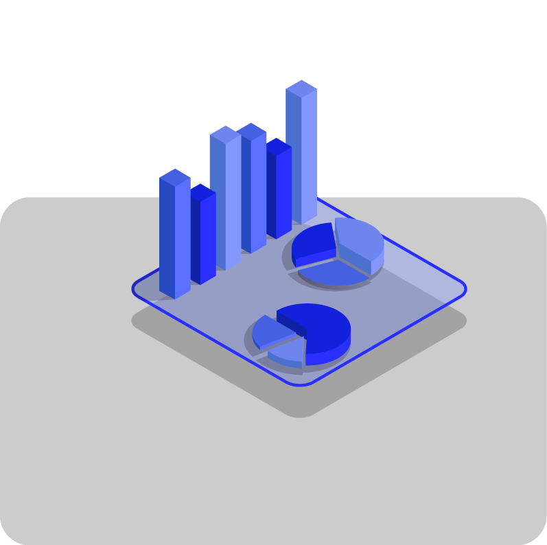
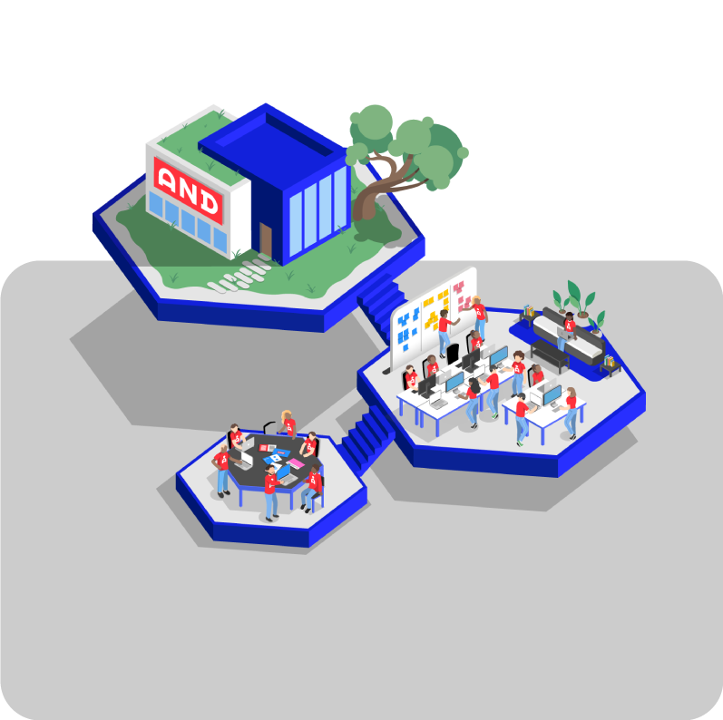
For the smaller featured illustrations, I followed a similar approach to the color scheme, keeping them monochromatic with occasional red accents to tie them together visually, ensuring consistency and a cohesive brand presence across the entire site.
Outcome:
The refreshed website resulted in a 15% increase in average dwell time, amplified average page views from 1.2 to 2.7 pages per session, and drove substantial improvement in web conversion rates, from 0.8% to 2.1%.
Additional artworks:
While the primary focus of this project was creating the 10 illustrations for the capabilities set, the website restructuring provided an opportunity to design more engaging artworks for other sections, such as those dedicated to the company's culture, values, and history or events.
This additional set of illustrations shares visual elements with the capabilities set, such as the interaction between miniature figures and their environment, ensuring they feel cohesive within the same brand family. However, the treatment of these images differs to prevent any overlap or confusion between the two sets.


